these are cool - I like the compositions. the bottom one does look dark, so i can't wait to see it in person. Also, I think the bottom one could use a little more variation in the background - blending the edges more where the colors change - like in the top pic. I keep focusing my eye more on the top half of the background where the red is and the two little blue islands.

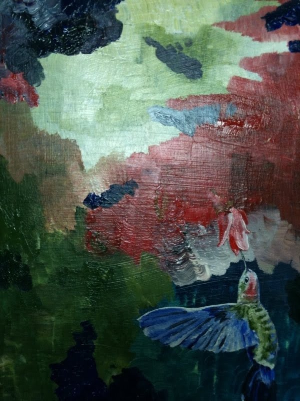 Here are two more -- again bad pictures (darker than they appear in person). Let me know your thoughts.
these are cool - I like the compositions. the bottom one does look dark, so i can't wait to see it in person. Also, I think the bottom one could use a little more variation in the background - blending the edges more where the colors change - like in the top pic. I keep focusing my eye more on the top half of the background where the red is and the two little blue islands.
ReplyDelete